Types
Content Dimmer
A dimmer can display content
Dog Photos
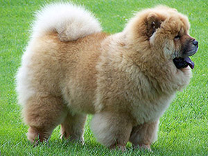
Your poodle photo uploaded successfully!
Your poodle photo uploaded successfully!
Page Dimmer
A dimmer can be formatted to be fixed to the page
Hello
States
Active
An active dimmer will dim its parent container
Disabled
A disabled dimmer cannot be activated
Variations
Dimmer
Simple Dimmer
A dimmer can be controlled without javascript
Lorem ipsum dolor sit amet, consectetuer adipiscing elit. Donec odio. Quisque volutpat mattis eros. Nullam malesuada erat ut turpis. Suspendisse urna nibh, viverra non, semper suscipit, posuere a, pede.
Lorem ipsum dolor sit amet, consectetuer adipiscing elit. Donec odio. Quisque volutpat mattis eros. Nullam malesuada erat ut turpis. Suspendisse urna nibh, viverra non, semper suscipit, posuere a, pede.
Inverted Dimmer
A dimmer can be formatted to have its colors inverted
Lorem ipsum dolor sit amet, consectetuer adipiscing elit. Donec odio. Quisque volutpat mattis eros. Nullam malesuada erat ut turpis. Suspendisse urna nibh, viverra non, semper suscipit, posuere a, pede.
Lorem ipsum dolor sit amet, consectetuer adipiscing elit. Donec odio. Quisque volutpat mattis eros. Nullam malesuada erat ut turpis. Suspendisse urna nibh, viverra non, semper suscipit, posuere a, pede.
Dimmer Events
A dimmer can trigger a visibility change on an event
$('.event.example .image')
.dimmer({
on: 'hover'
})
;
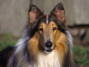
Puppy
View

Loaders inside Dimmers
Any loader inside a dimmer will automatically use an appropriate color to match
Loading
Lorem ipsum dolor sit amet, consectetuer adipiscing elit. Donec odio. Quisque volutpat mattis eros. Nullam malesuada erat ut turpis. Suspendisse urna nibh, viverra non, semper suscipit, posuere a, pede.
Lorem ipsum dolor sit amet, consectetuer adipiscing elit. Donec odio. Quisque volutpat mattis eros. Nullam malesuada erat ut turpis. Suspendisse urna nibh, viverra non, semper suscipit, posuere a, pede.
Usage
Display
You can display a dimmer by either invoking .dimmer('show') on a section or a dimmer itself. If you choose to dim a dimmable section, a dimmer will automatically be created.
// these two are the same
$('.ui.dimmable')
.dimmer('show')
;
$('.ui.dimmable .dimmer')
.dimmer('show')
;
Creating Dimmers
If a dimmer does not exist inside the element it will be created on first use.
$('h3')
.dimmer('toggle')
;
Showing a specific dimmer
If a dimmer is already inside an element, you can call behavior on the dimmable section or the dimmer itself.
// If a dimmer exists on a page, you can make it appear by calling it directly
$('.page.dimmer:first')
.dimmer('toggle')
;
Behavior
All the following behaviors can be called using the syntax:
$('.your.element')
.dimmer('behavior name', argumentOne, argumentTwo)
;
| Behavior | Description |
|---|---|
| add content (element) | Detaches a given element from DOM and reattaches element inside dimmer |
| show | Shows dimmer |
| hide | Hides dimmer |
| toggle | Toggles current dimmer visibility |
| get duration | Returns current duration for show or hide event depending on current visibility |
| get dimmer | Returns DOM element for dimmer |
| has dimmer | Returns whether current dimmable has a dimmer |
| is dimmer | Whether current element is a dimmer |
| is dimmable | Whether current element is a dimmable section |
| is active | Whether section's dimmer is active |
| is animating | Whether dimmer is animating |
| is page | Whether dimmable section is body |
| is enabled | Whether dimmer is not disabled |
| is disabled | Whether dimmer is disabled |
| is page dimmer | Whether dimmer is a page dimmer |
| set active | Sets page dimmer to active |
| set dimmable | Sets an element as a dimmable section |
| set dimmed | Sets a dimmable section as dimmed |
| set page dimmer | Sets current dimmer as a page dimmer |
| set disabled | Sets a dimmer as disabled |
Dimmer Settings
Dimmer settings modify its behavior
| Setting | Default | Description |
|---|---|---|
| closable | true | Whether clicking on the dimmer should close it automatically |
| on | false | Can be set to hover or click to show/hide dimmer on dimmable event |
| duration |
duration : {
show : 500,
hide : 500
}
|
Animation duration of dimming. If an integer is used, that value will apply to both show and hide animations. |
| transition | Fade | Named transition to use when animating menu in and out. Fade and slide down are available without including ui transitions |
Callbacks
Callbacks specify a function to occur after a specific behavior.
| Setting | Context | Description |
|---|---|---|
| onShow | dimmable | Callback on element show |
| onHide | dimmable | Callback on element hide |
| onChange | dimmable | Callback on element show or hide |
Templates
Templates are used to generate DOM elements
| Generates | Default |
|---|---|
| dimmer |
function() {
return $('').attr('class', 'ui dimmer');
}
|
DOM Settings
DOM settings specify how this module should interface with the DOM
| Setting | Default | Description |
|---|---|---|
| namespace | dimmer | Event namespace. Makes sure module teardown does not effect other events attached to an element. |
| selector |
selector: {
dimmable : '.ui.dimmable',
dimmer : '.ui.dimmer',
content : '.ui.dimmer > .content, .ui.dimmer > .content > .center'
}
|
Object containing selectors used by module. |
| className |
className : {
active : 'active',
dimmable : 'ui dimmable',
dimmed : 'dimmed',
disabled : 'disabled',
pageDimmer : 'page',
hide : 'hide',
show : 'show',
transition : 'transition'
}
|
Class names used to attach style to state |
Debug Settings
Debug settings controls debug output to the console
| Setting | Default | Description |
|---|---|---|
| name | Dimmer | Name used in debug logs |
| debug | True | Provides standard debug output to console |
| performance | True | Provides standard debug output to console |
| verbose | True | Provides ancillary debug output to console |
| errors |
error : {
method : 'The method you called is not defined.'
}
|
|